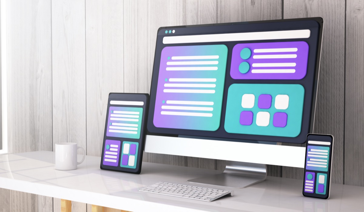
Learn how breakpoints optimize responsive design, ensuring responsive and performant websites on all devices, from mobile to desktop.
Have you ever thought about how a website can adapt to different devices, from desktop computers to smartphones? Understanding the importance of breakpoints in responsive design is essential for creating effective and attractive websites that work best on all screen sizes.

Definition of Breakpoints
In the web development, a breakpoint, or breaking point, is a specific screen size where a website's design changes to accommodate different display sizes. This concept is fundamental to ensuring a user experience Optimal on various devices, whether computers, tablets, or smartphones. Breakpoints are integrated into a website's CSS code, allowing the design to transform smoothly and adapt to the screen size.
How Breakpoints work
Breakpoints work through instructions specified in the site's CSS, usually in the form of media queries. These media queries detect the screen size and apply different CSS styles accordingly. This allows for display optimization, ensuring that every user benefits from an efficient interface, regardless of the device they are using. For example, a single column on a small screen can become a two-column panel on a larger screen, improving readability and usability.
Distinction between Definition and Resolution
It's crucial to distinguish between definition and resolution to avoid confusion. Definition refers to the total number of pixels in an image or screen, while resolution focuses on the density of pixels per inch (DPI or dots per inch). This distinction is important because it influences the clarity and sharpness of images displayed on different devices. A high-resolution device, such as a modern smartphone, requires careful design to fully utilize its display capabilities without compromising the viewing experience.
Using Developer Mode
To visualize and test the effectiveness of breakpoints, using developer mode in browsers is an essential step for any web developer. These tools, available in most browsers like Chrome, offer the ability to emulate different screen sizes and see how the site's design adjusts. This allows you to spot and correct potential issues before the site goes live, ensuring smooth user interaction on all devices.
HTML and CSS: The Basics of Responsive Design
HTML and CSS are the pillars of web development, each with a distinct but complementary role. HTML is responsible for structuring the website's content, providing the foundation upon which CSS styles will be applied. CSS is responsible for the site's appearance and aesthetics. Through media queries, CSS allows the design to dynamically adapt based on the detected screen size, ensuring that the content remains readable and the site easy to navigate.
Breakpoint approaches
There are two main approaches to defining breakpoints in responsive design: device-based and content-based.
Device Based
The device-based approach involves defining specific breakpoints for each type of device—for example, one for phones, another for tablets, and so on. This method relies on standard screen sizes to ensure the design meets the technical requirements of the most commonly used devices.
Content Based
In contrast, the content-driven approach prioritizes manual detection of points where the display needs adjustment. This method requires an evaluation of the interface to determine when the current design is no longer working effectively. This ensures more targeted personalization, focused on the content rather than the device.
Mobile First vs Desktop First
Two philosophies dominate responsive web design today: “Mobile First” and “Desktop First.”
Mobile First
The "Mobile First" strategy begins with optimization for mobile devices, considering their growing usage. The idea is to create a solid foundation for smaller screens, then expand for larger ones by adding elements that don't compromise the simplicity and performance originally designed for mobile.
Desktop First
Conversely, the "Desktop First" method aims to create a user experience for larger screens, which are often richer in content. This model is intended to be robust for desktop screens before reducing complexity for smaller devices. It requires special attention during the downsizing phase to maintain consistency and performance on portable devices.
Number of Recommended Breakpoints
The number of breakpoints to use varies and will depend primarily on budget, project needs, and the desired user experience. For a project with a limited budget, two breakpoints—one for mobile and one for desktop—may be sufficient. However, for advanced needs, multiple breakpoints may be required to ensure each screen size transition maintains the original design intent without sacrificing the user experience.
Importance of Responsive Design
The importance of breakpoints in responsive design cannot be underestimated. They facilitate the creation of adaptive websites that work effectively on a wide range of devices, eliminating the need to design separate interfaces for each type of device. This not only improves the user experience, but also contributes to better performance in terms of referencing and overall user satisfaction.
Your site can significantly benefit from breakpoints by ensuring a smooth and consistent experience, regardless of screen size. By strategically adapting design through media queries, every user can enjoy optimized navigation, whether they're using a large-screen desktop or a small smartphone.
Mastering the concepts of breakpoints in web development is essential for any digital professional looking to deliver a quality user experience across all device types. Whether you choose a "Mobile First" or "Desktop First" approach, responsive design principles will guide you toward creating sites that are not only aesthetically pleasing but also functional and accessible to all.
