
The story of Mosaic sheds light on the creation of the first graphical browser and the shift from an austere Internet to a visual, understandable and widely adoptable Web.
Before this breakthrough, the network was primarily experienced via keyboard, in text-based environments, with a logic similar to that of terminals. The uses already existed, but the learning curve hindered adoption. The arrival of a graphical interface changed everything, as the eye and mouse reduced the cognitive cost of navigation. This dynamic, now obvious to the general public, nevertheless remained a technological gamble in the early 1990s.
The web before Mosaic: a text-based internet that restricted access to insiders.
Pour comprendre l’histoire de Mosaic, il faut revenir à un contexte où l’user experience n’était pas un objectif prioritaire. Les premiers outils de consultation de ressources en ligne privilégiaient la sobriété technique. Les interfaces textuelles dominaient. Elles étaient efficaces, mais exigeantes. Elles demandaient de connaître des commandes, de manipuler des menus minimalistes et de comprendre des conventions parfois implicites. À la fin des années 1980 et au tout début des années 1990, l’accès au réseau restait minoritaire à l’échelle mondiale. La connectivité existait, mais elle touchait une fraction réduite de la population, ce qui renforçait le caractère “spécialiste” des usages.
In this landscape, solutions like Gopher structured information using a network of trees, while Lynx allowed web pages to be displayed in text mode. The principle of hyperlinks existed, but it was expressed without any visual presentation. Links were often indicated by colors or numbers. The user had to select an option and confirm, sometimes by entering an identifier. This model suited researchers, engineers, and students, but it left out less technical profiles. One question became crucial: how to transition this network of experts to a mainstream media platform?
A common thread helps to visualize the problem. Let's take the example of a fictional university lab, "Atelier Orion," where a team needs to share simulation results. With text-based tools, documents can be viewed, but graphics are downloaded separately. Images don't integrate seamlessly into the reading flow. The reader has to switch between commands, an external viewer, and then returning to the page. This friction reduces the impact. The scientific demonstration loses its pedagogical value. The Web needs a platform capable of bringing together text, links, and media on a single screen.
This need aligns with a fundamental intuition of software engineering: adoption depends on reducing friction. The browser is not just a display; it's a "product" in the ergonomic sense. Modern criteria (consistency, feedback, accessibility) weren't yet standardized for the web, but the underlying logic was already there. At this stage, a catalyst was missing: an application that would prove that a graphical interface isn't a luxury, but a requirement for scalability.
The challenges of readability and accessibility extend to the design of websites and applications today. An expert agency like DualMedia is part of this continuum: transforming a technical constraint into a seamless experience. This same philosophy is found in current topics such as performance and quality testing, with practical resources such as free tools for testing a websiteThe Web has changed, but the principle remains the same: make access immediate, otherwise users will lose interest. Final insight: before the graphic revolution, the Internet already existed, but it didn't "speak" to the uninitiated.
The birth of Mosaic at the NCSA: the story of Mosaic as the cornerstone of a universal web interface
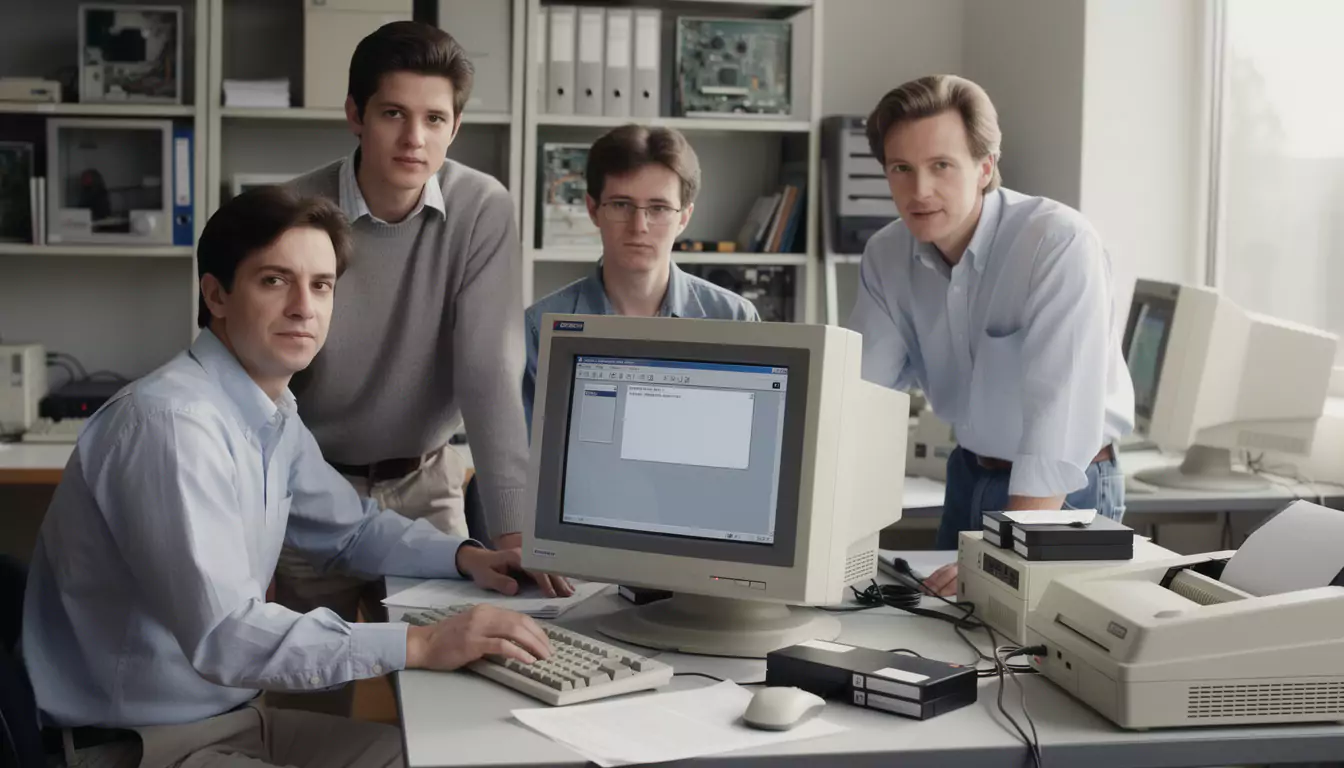
The story of Mosaic began in 1993 at the NCSA (National Center for Supercomputing Applications), in an environment characterized by rapid experimentation and early dissemination. A small team, led by Marc Andreessen and Eric Bina, aimed for a concrete objective: to make web navigation simpler, more readable, and more appealing. The key word was "graphical," but the reality was more nuanced. It wasn't simply about adding icons. It was about defining a display grammar that would encourage clicks, follow links, and explore further.
The first visible break concerns the integration of text and images within the same page. Today, this seems commonplace. In 1993, it was crucial. The user no longer had to look away from the browser to understand an illustration. This perceptual continuity accelerates comprehension. It also transforms the way content is conceived: a page can tell a story, demonstrate a point, persuade. The Web becomes an editorial support, not just a repository of linked documents.
The spread was swift. In 1994, Mosaic reached a very high download volume for the time, approaching one million. Behind this figure lay a clear signal: there was demand for a browser that resonated with the general public. Historical estimates also suggest a significant proportion of internet users were using Mosaic as their primary browser around 1994, confirming the ripple effect. Adoption, in this case, stemmed not from massive marketing, but from its inherent value. This is a valuable lesson for any digital project.
To visualize this value, let's return to "Atelier Orion." The team publishes a mini-site of results from ormais. A student opens a page that directly contains a curve image, followed by explanations and links to other scenarios. Navigation becomes narrative. The web ceases to be a succession of austere screens. It resembles augmented reading. Even for a technical audience, efficiency increases: less manipulation, more continuity.
Du point de vue design, Mosaic amorce des conventions qui seront reprises : zones cliquables plus explicites, gestion améliorée des hyperliens, approche plus “document” que “terminal”. Cette bascule annonce l’importance de la mise en forme, de la typographie, et de l’architecture de l’information. Dans les projets actuels, ces points se traduisent par des choix concrets : cohérence de grille, hiérarchie de titres, styles de liens, et adaptation multi-écrans. DualMedia accompagne précisément ces arbitrages, qu’il s’agisse d’un site vitrine, d’un produit SaaS ou d’une mobile application. Pour cadrer la démarche, un repère utile reste how to design a quality digital toolBecause success rarely comes from a single "spectacular" feature. Final insight: Mosaic didn't just add graphics; it demonstrated that an interface is an adoption multiplier.
To immerse oneself in the atmosphere and stories surrounding these years, contextualized video research helps to grasp the speed of developments and interface choices.
Key innovations: images, hyperlinks and ergonomics, at the heart of Mosaic's story
Mosaic's story can also be read as a list of pragmatic innovations. The goal isn't to pile on features, but to observe how each one reduces friction. Integrating images into the page plays a central role. It transforms the web page into a composite object, where the visual supports the meaning. This layout opens the page to online editing, enhanced documentation, educational support, and then e-commerce. The image becomes a language. Hypertext, for its part, becomes natural navigation.
In terms of usability, Mosaic makes links more easily identifiable and navigation more guided. User feedback improves. The main actions (opening a page, returning, following a link) flow more smoothly. This "critical path" is shorter. In a digital product, shortening the critical path mechanically increases satisfaction and success rates. This rule, still valid in 2026, is now measured using metrics: completion time, error rate, and drop-off rate. Mosaic didn't have modern analytics, but its user-centric approach was already proving its worth.
Another important point concerns stability. Mosaic is available on several environments. This multi-platform distribution accelerates word-of-mouth. In current terms, we would talk about distribution and compatibility strategy. This echoes contemporary choices between native and cross-platform development. DualMedia often intervenes in these trade-offs, especially when a product targets both mobile and web with budget, time, and team constraints. Comparisons between frameworks illustrate this type of decision, for example the duel between Ionic and Xamarin, which highlights the impacts on performance, maintenance and experience.
To make these innovations more tangible, a structured list clarifies what Mosaic apporte to a user of 1993-1994, without projecting modern standards that did not yet exist.
- Combined display of text and images on the same page, for continuous reading.
- More intuitive hypertext navigation, with links that are more visible and easier to activate.
- A “document” approach that encourages the publication and consultation of edited content.
- Rapid dissemination thanks to availability on multiple systems, facilitating adoption.
- Ripple effect on website creators, who can finally script the information.
A mini case study helps to connect these points. A fictional university library, “Aster Media Library,” publishes an illustrated catalog of digitized manuscripts online. With a text-based browser, the benefits are limited: the image is retrieved separately, and the context is lost. With Mosaic, the image appears in the correct place, the description follows, and the links lead to other works. The result: more browsing, greater understanding, and better transmission of heritage value. Final insight: Mosaic's innovations are modest in isolation, but they become decisive when they align with the actual user experience.
From Mosaic to Netscape and beyond: the story of Mosaic as a catalyst for a browser market
Mosaic's story doesn't end with its initial success. It sparked a market. Once it was proven that a graphical browser could appeal to a massive audience, the ecosystem took off. Netscape Navigator quickly emerged and capitalized on these gains. In the second half of the 1990s, competition intensified. It focused on speed, compatibility, and the ability to integrate new web components. Historical figures of dominance (such as Netscape's very high market share around 1994-1995) primarily illustrate one fact: the interface had become a strategic entry point.
This period also creates tension around standards. When several players implement features in divergent ways, developers suffer. They have to test on multiple browsers, work around bugs, and adapt the rendering. This issue, already present in other forms, is now reflected in the diversity of engines, security policies, extensions, and mobile constraints. Part of DualMedia's job is precisely to ensure a consistent experience despite this fragmentation: auditing, testing, responsive design, performance, and accessibility.
To illustrate the continuities and differences, a table juxtaposes several key milestones. The aim is not to be exhaustive, but to provide a clear overview of the legacy.
| Period | Browser / step | Main Apport | Heritage linked to the history of Mosaic |
|---|---|---|---|
| Before 1993 | Lynx, Gopher | Text access, structured navigation | Highlights the barrier to entry that Mosaic will reduce |
| 1993 | Mosaic (NCSA) | Graphical interface, images and text combined | Validates the Web as a mainstream medium |
| 1994-1995 | Netscape Navigator | Industrialization, massive diffusion | Amplifies the momentum initiated by Mosaic |
| 1995+ | Internet Explorer | OS integration, concurrency forte | Accelerates standardization and the compatibility wars |
| 2000s+ | Firefox, Chrome | Performance, security, extensions | It perfects the initial promise: simplicity + power |
In current projects, the "browser" question has also become a platform question. Experiences are divided between web, mobile web, and applications. Standards have progressed, but the product logic remains inherited from Mosaic: reducing the time between intent and access to information. For a company that wants to expand its audience, converting a website into a mobile application can strengthen retention and home screen presence. DualMedia has mastered this approach, notably through the transformation of a WordPress blog into a mobile applicationThis is useful for industrializing an experience without starting from scratch. Final insight: Mosaic created a market because it proved that web access could become a mass-market product.
To contextualize the evolution of browsers and uses, a video exploration of the major stages helps to link technical choices to their cultural effects.
Product and design heritage: why the Mosaic story guides web and mobile projects
L’histoire de Mosaic a laissé une empreinte plus large que la simple chronologie des navigateurs. Elle a normalisé l’idée qu’un logiciel d’accès au Web doit prioriser la lisibilité, la découverte et la confiance. Cette idée s’observe aujourd’hui dans des domaines très concrets : performance perçue, sécurité, gestion des permissions, design responsive, accessibilité. Les utilisateurs modernes tolèrent peu les frictions. Une page lente, un rendu instable, un parcours confus : le rebond est immédiat. La bascule initiée par Mosaic a donc une conséquence directe en 2026 : l’exigence UX est structurelle.
Responsive design perfectly illustrates this extension. Mosaic's goal was to unify the on-screen experience at a time when device diversity was lower. Today, diversity is at its maximum: smartphones, tablets, large screens, foldables, TVs, embedded WebViews. Breakpoints and adaptive layout are becoming essential expertise. DualMedia regularly addresses these issues, and an operational benchmark can be found in the importance of breakpoints in responsive designThe idea remains mosaic in the literal sense: to recompose a page according to the context, without losing the meaning.
Another legacy concerns tools. Content creators and developers need a reliable environment. Mosaic democratized publishing. The modern web democratizes production, but imposes new standards: editorial quality, SEO, graphic consistency. In a production chain, simple tools prevent costly errors. For the Editoriales teams, free online 1TP5 graphing calculators facilitate quick review and reduction of inconsistencies, which also improves the credibility of a site.
A project anecdote helps connect Mosaic's legacy to a current need. A fictional SME, "CyclaTech," launches a mobile booking platform. The first prototype works, but users abandon it when trying to fill out a form because the mobile interface is too cluttered. DualMedia then conducts an audit: visual hierarchy, size of touch zones, reduction of fields, image optimization, and clarification of CTAs. After the redesign, the user journey is streamlined. Conversions increase. The mechanism is exactly the same as in 1993: when access becomes intuitive, adoption follows.
Finally, the legacy extends to strategy: a graphical browser broadened the web's audience. Today's products must broaden their audience through clarity, performance, and multi-channel consistency. Whether it's a showcase website, an e-commerce platform, or an application, DualMedia positions itself as an expert partner to design, develop, and scale robust web and mobile experiences. Final insight: Mosaic's lasting lesson can be summed up in one actionable phrase: the interface is not a layer, it's the product.
Would you like to get a detailed quote for a mobile application or website?
Our team of development and design experts at DualMedia is ready to transformer your ideas into reality. Contact us today for a quick and accurate quote: contact@dualmedia.fr