
Liquid Glass transforms the iOS 18/19 design system by introducing a more translucent, dynamic, and immersive interface that web designers can methodically adapt without sacrificing UX, readability, or performance.
Liquid Glass on iOS 18/19: what really changes in the Apple interface
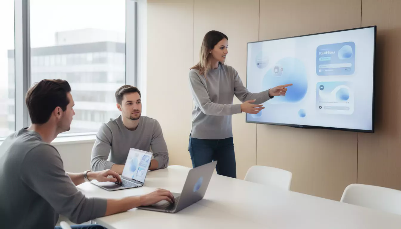
Liquid Glass marks a major visual shift in the Apple ecosystem. Presented as part of the evolution announced at WWDC 2025, this visual language highlights transparent surfaces, depth effects, and components that seem to react to the content displayed behind them.
The principle is not just to make the interface shinier. Apple is seeking to give more importance to content, while making menus, buttons, widgets, and navigation bars visually lighter.
In discussions around iOS 18/19, Liquid Glass primarily represents a clear direction: the mobile interface is becoming less flat, more contextual, and more responsive to motion. This change is already influencing the way web agencies, product designers, and front-end developers think about modern interfaces.
For an agency like DualMedia, specializing in web and mobile, the challenge is to translate this aesthetic into concrete, fast, and accessible web experiences. So the real issue is not copying Apple, but understanding the visual rules that make this approach useful.
Why Liquid Glass is more than just a transparency effect
Transparency is only the visible part of the concept. Liquid Glass is based on a combination of effects: translucency, refraction, background adaptation, morphing, emphasized rounding, and fluid animations.
A button is no longer simply placed on the screen. It floats, lets its environment show through, changes slightly depending on light or dark mode, then follows the user’s gesture with a gradual transition.
This logic recalls certain intentions of visionOS, designed for Apple Vision Pro. Depth, visual layers, and floating elements become natural cues to guide the eye without cluttering the screen.
On the web, this approach can enhance a booking interface, a SaaS bord, a customer area, or a business application. It becomes relevant as soon as it improves the visual hierarchy instead of producing a simple trendy effect.
The key characteristics of the Liquid Glass design system
Liquid Glass combines several interface choices that work together. Taken separately, these effects already exist in web design, notably with glassmorphism, but Apple pushes them toward more advanced system-wide consistency.
The common thread is simple: reduce the feeling of rigidity and renforce continuity between screens. The user should feel that the interface adapts to their action, their context, and the visible content.
- Translucent surfaces that allow the underlying content to show through without disappearing completely.
- Floating controls, often rounded, that seem placed above the main interface.
- Progressive transformation animations between two states, similar to a morphing effect.
- Reflections and light variations that renforce the perception of depth.
- Adaptation to light mode, dark mode, and colored backgrounds.
- Visual unification between iPhone, iPad, Mac, Apple Watch, Apple TV, and immersive interfaces.
These elements should not be applied mechanically. A successful interface selects the useful effects, limits them to key areas, and maintains solid navigation cues.
Liquid Glass and UX: the major risk remains readability
Liquid Glass design is appealing at first glance, but it requires strict discipline. Too much transparency can make text difficult to read, especially on colorred backgrounds, high-contrast photos, or very dense interfaces.
Apple has provided accessibility options, including reduced transparency. This decision recalls a fundamental UX principle: visual effect should never take precedence over understanding.
On a website, the same problem quickly appears. A translucent navigation bar placed over a photo can look elegant on desktop, then become unreadable on mobile if contrast is not properly controlled.
Serious work must therefore incorporate contrast rules, font sizes, focus states, user preferences, and testing on real screens. Teams working on l’UX design know that aesthetics are only worthwhile if they speed up action.
How to adopt Liquid Glass on the web without degrading performance
Adapting Liquid Glass to the web requires a pragmatic approach. Blur, transparency, and visual layering effects can become costly if every component uses heavy filters or permanent animations.
The right method is to reserve these effects for components with high forte value: navigation, main cards, modals, action buttons, dashboard widgets, or contextual panels. The rest of the interface should remain understated to preserve display speed.
In CSS, properties such as backdrop-filter, border-radius, opacity, transform, and transition already make it possible to reproduce part of this aesthetic. For more advanced rendering, SVG and WebGL can enhance certain effects, but they must be used sparingly.
In a client project, DualMedia often favors a prototyping phase before full integration. This step makes it possible to validate the balance between appearance, accessibility, and performance, especially on mobile.
| Liquid Glass element | Recommended web adaptation | Point of vigilance |
|---|---|---|
| Translucent surface | Use a semi-transparent background with controlled blur | Maintain sufficient contrast for text |
| Floating control | Create rounded components with a light shadow | Avoid hiding important content |
| Liquid animation | Prefer transform and opacity for smooth transitions | Limit continuous animations on mobile |
| Dynamic reflection | Use a subtle gradient or a pseudo-element | Do not create visual distraction |
| Adaptive interface | Provide light, dark, and high-cortrast variants | Respect accessibility preferences |
This table summarizes an essential rule: the web can draw inspiration from Liquid Glass, but it must remain more selective than an operating system controlled end to end.
The link between Liquid Glass, glassmorphism, and flat design
Liquid Glass did not come out of nowhere. It extends several already familiar trends: Apple’s historic skeuomorphism, flat design, and then glassmorphism popularized in many SaaS interfaces.
Flat design simplified screens by removing overly decorative effects. This approach remains valuable, but it can sometimes produce cold interfaces, where levels of importance lack depth.
Liquid Glass reintroduces materiality without returning to the excesses of realistic icons or heavy textures. It adds an optical, almost physical layer, while preserving a minimalist logic.
To place this evolution back in the history of interfaces, it is useful to compare it with the principles of flat design. The future of web design is not about choosing a side, but about combining simplicity, depth, and readability.
Web components to rethink with Liquid Glass
Some components lend themselves better than others to a Liquid Glass adaptation. Navigation comes first, because it structures the experience and remains visible throughout many user journeys.
A translucent navbar can give an impression of modernity, provided it is stable, readable, and compatible with variable backgrounds. The topic ties directly into the best practices of a effective web navigation, where elegance must always serve orientation.
Information cards are also good candidates. In a business application, a floating card can make a key indicator stand ort without weighing down the dashbord.
Modals, context menus, audio players, filter panels, and personalization widgets can also benefit from this visual language. The important thing is to maintain a clear hierarchy between primary and secondary actions.
Concrete example: redesigning a business application with a Liquid Glass aesthetic
Let’s imagine an SME that uses an internal application to track its field operations. The current interface works, but it piles up tables, buttons, and filters in a dense layout.
A redesign inspired by Liquid Glass can improre the situation without disrupting usage patterns. The filters become a floating panel, critical alerts use a well-contrasted translucent card, and quick actions appear only when the user selects an operation.
This type of choice reduces cognitive load. The user first sees the priority information, then gradually accesses the details.
In a professional context, the goal is not to impress with reflections. It is about clarifying the journey, smoothing transitions, and making the tool more pleasant to use on a daily basis.
This logic also applies to business application development, where ergonomics directly influence team productivity. A more modern interface can reduce errors, speed up formation, and reinforrce internal adoption.
Liquid Glass and mobile development: consistency to plan for from the design stage
Liquid Glass primarily concerns the Apple ecosystem, but its consequences go well beyond iOS. Users are getting used to interfaces that are smoother, more responsive, and more integrated across their devices.
A mobile application that feels rigid or outdated therefore risks creating a noticeable gap. Even on Android or on the web, expectations are rising around smooth transitions, adaptive components, and useful micro-interactions.
For a mobile project, consistency must be considered from the mockup stage. Designers define transparency levels, motion rules, interactive states, and accessibility variants before development.
This approach aligns with the requirements ofmobile development engineering. The earlier the design system is documented, the less time the team loses corrrecting inconsistencies at the end of the project.
The role of AI in Liquid Glass-inspired interfaces
Liquid Glass is arriving in a context where AI is gradually being integrated into digital products. Apple is moving forward in steps: live translation, description of displayed content, contextual assistance, automations, and intelligent suggestions.
On the web, the combination of adaptive design and artificial intelligence opens up interesting possibilities. An interface can adjust certain recommendations, simplify a journey, or priorize information depending on the usage context.
However, we must avoid the trap of an interface that changes too much. If AI modifies the screen without clear logic, the user loses their bearings and trust declines.
The most robust projects combine personalization and stability. This orientation aligns with reflections on AI and web design, where autonomy must remain in the service of understanding.
Accessibility: adapting Liquid Glass to real-world use cases
A translucent interface may look magnificent in a keynote and be less comfortable on the subway, in the sun, or on an aging screen. Accessibility must therefore accompany every graphic decision.
On iOS, the ability to reduce transparency shows that design must remain adaptable. On the web, this logic can be reproduced with alternative themes, a high-contrast mode, and special attention to system preferences.
Keyboard focus states, text on blurred backgrounds, secondary buttons, and notifications must be tested seriously. A simple background variation can completely change the perception of a component.
A good design system inspired by Liquid Glass therefore provides for several levels of visual intensity. The user must be able to enjoy a modern interface without suffering unnecessary visual fatigue.
SEO, performance, and Liquid Glass: mistakes to avoid
A site inspired by Liquid Glass must not become slower. Heavy visual effects can penalize loading, increase GPU consumption, and deteriore the mobile experience.
SEO also depends on technical signals: speed, visual stability, accessibility, HTML structure, and browsing comfort. Advanced aesthetics must therefore be integrated into an overall strategy, not added as a final decoration.
Common mistakes are well known: background videos that are too heavy, excessive blur over large areas, unoptimized animations, insufficient contrast, and components that are not keyboard accessible. They can give a premium impression for three seconds, then degrade the entire journey.
To align design and visibility, it is relevant to rely on a complete technical framework such as a updated SEO guide. Performance is not the enemy of design; it is the condition for its use.
How to integrate Liquid Glass into a web design system
To adopt Liquid Glass on a website or application, rules must be formalized. Without a design system, each screen risks using a different level of blur, rounding, or transparency.
The first step is to define the visual materials: translucent background, bordure, shadow, reflection, blur intensity, and behavorr in dark mode. These properties then become reusable design tokens.
The second step concerns components. A card, a navigation bar, a dropdown menu, or a modal must share the same state rules: default, hover, focus, active, disabled, and error.
Finally, the limitations must be documented. For example, never place long text on a background that is too transparent, avoid using multiple stacked blurry layers, or disable certain effects on less powerful devices.
This method aligns with the major UX/UI trends for websites. The most effective interfaces are not those that pile on effects, but those that orchortrate them consistently.
Should Liquid Glass be adopted on all websites?
Liquid Glass is not suitable for all contexts. A very minimalist institutional website, a medical platform, or a banking interface may need a more stable and more direct visual language.
On the other hand, this aesthetic can be relevant for a SaaS startup, a mobile application, a creative product, a media platform, a premium dashborrd, or a high-end e-commerce experience. It all depends on the audience, the context of use, and the expected level of trust.
A good approach is to test Liquid Glass on a few components before extending the style. A navigation menu, a product card, or a settings panel are often enough to measure the real impact.
DualMedia generally recommends starting with a clickable prototype, then confronting it with concrete scenarios. This step through actual use avoids confusing a graphic trend with a measurable improrvement in the experience.
Our opinion
Liquid Glass is one of the most interesting visual evolutions in the Apple ecosystem, because it brings depth, movement, and material back to the center of the interface. Its relevance goes beyond iOS 18/19: it is already influencing user expectations for modern websites and applications.
Its adoption on the web should remain measured. When used well, this language apporrts fluidity, better visual hierarchy, and a premium product feel; when used poorly, it harms readability, performance, and accessibility.
The best approach is to transform Liquid Glass into design principles, rather than a simple imitation. It is precisely in this balance between aesthetics, technology, UX and performance that a web agency and mobile like DualMedia can support a project effectively.
What is Liquid Glass on iOS 18/19?
Liquid Glass is a visual language based on transparency, depth, and fluid animations. It transforms interface components into more dynamic, glass-like surfaces, while giving more space to the displayed content.
Is Liquid Glass replacing flat design?
Liquid Glass does not completely replace flat design; it complements it. It preserves a minimalist logic, but adds material, transparency, and motion effects to better structure the screen.
Can Liquid Glass be reproduced on a website?
Yes, it is possible to take inspiration from Liquid Glass on the web with CSS, SVG, or WebGL. Properties such as backdrop-filter, semi-transparent backgrounds, soft bordures, and transitions make it possible to create a similar aesthetic, provided readability is preserved.
Is Liquid Glass suitable for business applications?
Yes, Liquid Glass can be suitable for a business application if the effects help understanding. Floating cards, contextual panels, and visual filters can improve use, but important data must remain perfectly legible.
What are the UX risks of Liquid Glass?
The main UX risk of Liquid Glass is reduced readability. Excessive transparency, an overly busy background, or overly prominent animations can slow comprehension and tire the user.
Does Liquid Glass impact web performance?
Yes, some Liquid Glass effects can impact performance if they are poorly optimized. Blur filters, large translucent surfaces, and continuous animations should be limited, especially on mobile.
How can you make a Liquid Glass interface accessible?
An accessible Liquid Glass interface must offer sufficient contrast and visual alternatives. A more understated mode should be provided, system preferences should be respected, and text should be tested on different backgrounds.
Is Liquid Glass suitable for all websites?
No, Liquid Glass is not suitable for all websites. It is relevant for premium, creative, or application-style interfaces, but less suited to services that require maximum simplicity and immediate readability.
What difference is there between Liquid Glass and glassmorphism?
Glassmorphism is a graphic trend centered on the glass effect, while Liquid Glass is a more comprehensive interface system. It adds rules for movement, adaptation to context, and consistency across platformes.
Why choose DualMedia to adopt Liquid Glass on the web?
DualMedia can help translate Liquid Glass into a truly usable web or mobile interface. The agency works on UX, development, performance, and the consistency of the design system in order to avoid a merely decorative effect.
Would you like to get a detailed quote for a mobile application or website?
Our team of development and design experts at DualMedia is ready to turn your ideas into reality. Contact us today for a quick and accurate quote: contact@dualmedia.fr